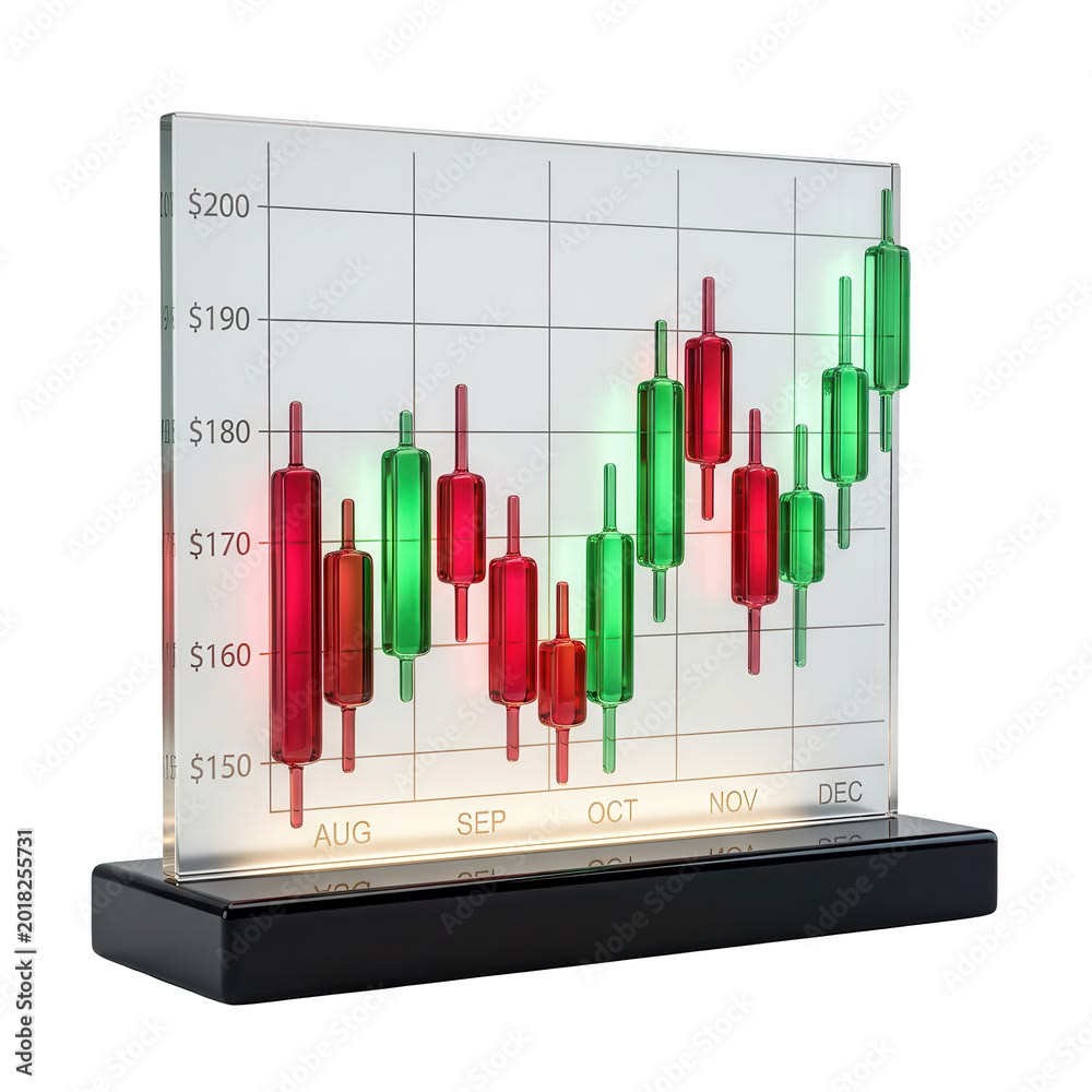
If you’ve ever glanced at a trading platform and seen rows of small red and green bars stacked together like a city skyline, you’ve seen a candlestick chart. It’s the most widely used way to visualize price movement in trading today, used across forex, stocks, crypto, and commodities alike. And yet, for beginners, it can look like a wall of noise — colored blocks with thin lines poking out the top and bottom, seemingly at random.
The truth is candlestick charts are one of the most intuitive tools in all of technical analysis, once you understand the logic behind them. Each candle tells a small, self-contained story about a battle between buyers and sellers over a specific period of time. Learn to read that story, and you start to see the market not as random noise, but as a record of collective decision-making playing out in real time.
This guide breaks down exactly what candlesticks are, how to read them, and how to start recognizing the patterns that traders around the world rely on every day.
What Is a Candlestick Chart?
A candlestick chart is a way of displaying the price movement of an asset — a currency pair, a stock, a cryptocurrency — over a fixed period of time. Each “candle” represents one unit of time, which could be one minute, one hour, one day, one week, or any other timeframe the trader selects.
Candlestick charts originated in 18th-century Japan, where rice traders used them to track market prices and predict future movements. The technique was later introduced to the Western world in the 1990s and has since become the dominant charting style across nearly every financial market.
What makes candlesticks so popular is that each one packs four critical pieces of information into a single visual: the opening price, the closing price, the highest price, and the lowest price reached during that time period. Compare that to a simple line chart, which only shows the closing price, and it’s easy to see why candlesticks became the standard — they simply contain more useful information per glance.
The Anatomy of a Single Candlestick
Every candlestick is made up of two main parts: the body and the wicks (also called shadows).
The Body
The body is the thick, rectangular part of the candle. It represents the range between the opening price and the closing price for that time period.
- If the closing price is higher than the opening price, the candle is typically colored green or white, and it’s called a bullish candle. This means buyers were in control, pushing the price upward over that period.
- If the closing price is lower than the opening price, the candle is typically colored red or black, and it’s called a bearish candle. This means sellers were in control, pushing the price downward.
The size of the body matters too. A long body indicates strong buying or selling pressure — the price moved a significant distance from open to close. A short or small body indicates indecision or a relatively balanced fight between buyers and sellers.
The Wicks (Shadows)
The thin lines extending above and below the body are called wicks or shadows. These represent the highest and lowest prices reached during the time period, even if the price didn’t close there.
- The upper wick shows the highest price reached before the candle closed.
- The lower wick shows the lowest price reached before the candle closed.
Wicks are just as important as the body itself, because they reveal rejection. A long upper wick means price rallied higher during the period but was pushed back down before closing — a sign that sellers stepped in and rejected higher prices. A long lower wick means price dropped significantly but buyers stepped in and pushed it back up — a sign of rejection at the lows.
Putting It Together
So, for any single candle, you can read its story in four data points:
- Open — where price started the period
- High — the highest point reached
- Low — the lowest point reached
- Close — where price ended the period
These four points are often abbreviated as OHLC, and they’re the foundation of every candlestick on every chart you’ll ever look at.
Understanding Timeframes
One of the most important things to grasp early on is that a single candle’s meaning is entirely dependent on the timeframe you’ve selected. A candle on a 1-minute chart captures just 60 seconds of price action. A candle on a daily chart captures an entire day’s trading. A candle on a weekly or monthly chart compresses days or weeks of activity into one visual block.
Traders choose timeframes based on their strategy:
- Short-term traders (scalpers and day traders) often use 1-minute, 5-minute, or 15-minute charts, since they’re entering and exiting positions within minutes or hours.
- Swing traders typically use 1-hour, 4-hour, or daily charts, holding positions for several days to a few weeks.
- Long-term investors often rely on weekly or monthly charts to identify broader trends over months or years.
The same currency pair or stock can look completely different depending on the timeframe — a chart might show a clear uptrend on the daily timeframe while looking choppy and directionless on the 5-minute timeframe. This is why it’s important to always be clear about which timeframe you’re analyzing, and ideally to check multiple timeframes before making a trading decision.
Why Color and Body Size Matter
Beyond just bullish versus bearish, the relative size of the body and wicks gives traders a sense of momentum and conviction.
- A long green candle with little to no wicks suggests strong, sustained buying pressure throughout the entire period — buyers were in control from open to close.
- A long red candle with little to no wicks suggests strong, sustained selling pressure — sellers dominated the entire period.
- A small body with long wicks on both sides suggests indecision — neither buyers nor sellers could maintain control, and price whipsawed back and forth before settling near where it started.
This is the first layer of reading candlestick charts: understanding what a single candle says about market sentiment during that specific window of time. The next layer — and where things get genuinely useful — is learning to recognize patterns formed by multiple candles together.
Common Single-Candle Patterns
Certain individual candle shapes are so common and so reliable in signaling potential reversals or continuations that they’ve earned their own names.
Doji
A doji forms when the opening and closing prices are virtually identical, creating a candle with almost no body — just a thin line with wicks on either side. A doji signals indecision in the market. Depending on where it appears in a trend, it can hint at a potential reversal, especially when it shows up after a strong sustained move in one direction.
Hammer
A hammer has a small body near the top of the candle and a long lower wick, with little to no upper wick. It typically appears after a downtrend and suggests that sellers pushed price down during the period, but buyers stepped in forcefully and pushed it back up before the close. This is often interpreted as a potential bullish reversal signal.
Inverted Hammer / Shooting Star
These look like an upside-down hammer — a small body near the bottom with a long upper wick. The interpretation depends on context:
- A shooting star appears after an uptrend and suggests buyers pushed price up, but sellers rejected those higher prices and pushed it back down — a potential bearish reversal signal.
- An inverted hammer appears after a downtrend and can suggest weakening selling pressure, though it’s generally considered a weaker signal than other reversal patterns and usually requires confirmation.
Marubozu
A marubozu is a candle with little to no wicks at all — just a long, solid body. A bullish marubozu (long green body, no wicks) indicates buyers were in complete control from the opening bell to the close. A bearish marubozu indicates the same, but for sellers. These candles reflect strong conviction and momentum.
Spinning Top
A spinning top has a small body with wicks of roughly similar length on both sides. Like the doji, it reflects indecision, though the small body (rather than virtually no body) suggests slightly less extreme equilibrium between buyers and sellers.
Multi-Candle Patterns
While single candles offer useful clues, many of the most well-known and widely used candlestick signals involve two or three candles working together. These patterns tend to carry more weight because they capture a shift in momentum over a slightly longer stretch of time.
Bullish Engulfing
This pattern consists of a small red (bearish) candle followed immediately by a larger green (bullish) candle that completely “engulfs” the body of the previous candle. It typically appears at the bottom of a downtrend and suggests that buyers have decisively taken over from sellers, often marking the start of a new upward move.
Bearish Engulfing
The mirror image of the above: a small green candle followed by a larger red candle that engulfs it entirely. This typically appears at the top of an uptrend and suggests sellers have overwhelmed buyers, often signaling the start of a downward move.
Morning Star
A three-candle pattern that typically appears at the bottom of a downtrend. It consists of a long red candle, followed by a small-bodied candle (showing indecision), followed by a long green candle that closes well into the body of the first candle. This sequence suggests selling pressure is fading and buyers are stepping back in — a classic bullish reversal signal.
Evening Star
The bearish counterpart to the morning star. It appears at the top of an uptrend and consists of a long green candle, a small indecisive candle, and then a long red candle that closes well into the first candle’s body. This suggests buying pressure is exhausted and sellers are taking control.
Three White Soldiers
Three consecutive long green candles, each opening within the previous candle’s body and closing higher than the last. This pattern reflects sustained, steady buying pressure and is generally seen as a strong bullish continuation or reversal signal, particularly after a downtrend.
Three Black Crows
The bearish mirror image — three consecutive long red candles, each closing lower than the last. This reflects sustained selling pressure and is typically viewed as a strong bearish signal.
Harami
A harami pattern occurs when a small candle forms entirely within the body of the previous, larger candle. A bullish harami (small green candle inside a larger red candle) can suggest a slowdown in selling momentum, while a bearish harami (small red candle inside a larger green candle) can suggest a slowdown in buying momentum. Like the doji, harami patterns generally signal indecision rather than a guaranteed reversal.
How to Actually Use Candlestick Patterns in Trading
Recognizing a pattern is only the first step. Knowing how to use it responsibly is what separates a casual chart-watcher from someone applying real technical analysis.
1. Context matters more than the pattern itself
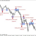
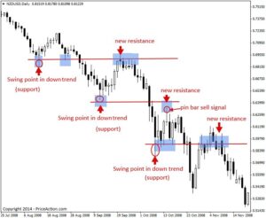
A bullish engulfing candle that appears in the middle of a sideways, range-bound market means far less than the exact same pattern appearing at a well-established support level after a sustained downtrend. Always ask where the pattern is forming, not just what it looks like.
2. Combine candlestick patterns with other tools
Most experienced traders don’t rely on candlestick patterns in isolation. They look for confluence — multiple signals lining up together. This might include:
- Support and resistance levels — price zones where the market has historically reversed
- Trendlines — to understand the broader directional bias
- Volume — a reversal pattern accompanied by a spike in trading volume carries more weight than one with low volume
- Indicators — tools like the RSI (Relative Strength Index) or moving averages can help confirm whether a market is overbought, oversold, or trending
3. Wait for confirmation
Many traders avoid acting on a pattern the moment it appears, instead waiting for the following candle to confirm the move. For example, after spotting what looks like a hammer at the bottom of a downtrend, a cautious trader might wait to see if the next candle closes higher before entering a trade, reducing the risk of acting on a false signal.
4. Understand that no pattern is guaranteed
Candlestick patterns reflect probabilities and tendencies based on historical price behavior, not certainties. Markets are influenced by countless factors — news events, broader economic conditions, large institutional orders — that can override even the most “reliable” pattern. Treating any single pattern as a guaranteed signal is one of the most common mistakes beginners make.
5. Practice on historical charts
One of the best ways to build pattern-recognition skill is to review historical charts and identify patterns after the fact, then study what happened next. Many trading platforms also offer “replay” features that let you scroll through historical price action candle by candle, simulating what it would have felt like to trade that move in real time.
Common Mistakes Beginners Make When Reading Candlesticks
- Seeing patterns everywhere — After learning a handful of patterns, it’s tempting to start spotting them constantly, even where the signal is weak or ambiguous. Not every small wick or slightly larger body qualifies as a meaningful pattern.
- Ignoring the broader trend — A bullish reversal pattern in the middle of a powerful, well-established downtrend is far less reliable than the same pattern appearing at a logical support zone.
- Trading a pattern in isolation — Relying solely on candlestick shapes without considering support and resistance, trend direction, or volume tends to produce inconsistent results.
- Misreading the timeframe — A “strong” bullish signal on a 1-minute chart may be meaningless noise compared to the broader picture playing out on the 4-hour or daily chart.
- Overcomplicating things early on — There are dozens of named candlestick patterns, but beginners are usually better served by mastering a handful of the most common and reliable ones — engulfing patterns, dojis, hammers, and stars — before trying to memorize every obscure variation.
Candlesticks vs. Other Chart Types
It’s worth briefly understanding how candlestick charts compare to the alternatives, since beginners sometimes wonder why candlesticks are so dominant.
- Line charts simply connect closing prices over time. They’re clean and easy to read at a glance, but they discard a huge amount of information — namely, the opening price, high, and low for each period.
- Bar charts (OHLC bars) display the same four data points as candlesticks — open, high, low, close — but using small tick marks rather than a colored body. They contain the same information as candlesticks but are generally considered harder to read quickly, since the visual contrast between bullish and bearish periods isn’t as immediate.
- Candlestick charts combine the completeness of bar charts with a far more intuitive visual format, which is why they’ve become the standard across nearly every modern trading platform.
Final Thoughts
Candlestick charts turn raw price data into a visual language — one that, once learned, lets you glance at a chart and immediately get a sense of who’s winning the tug-of-war between buyers and sellers. Every wick tells you where price was rejected. Every body tells you who closed in control. And every pattern, when read in the right context, offers a clue about what might happen next.
That said, candlesticks are a tool, not a crystal ball. They work best when combined with an understanding of broader trend direction, key support and resistance levels, and sound risk management — never as a standalone guarantee of where price is headed. For beginners, the most productive path forward is to start small: master the basic anatomy of a candle, learn to recognize a handful of the most reliable patterns, and practice spotting them on historical charts before ever applying them to a live trade. Over time, what once looked like a random wall of red and green blocks will start to read like a story — because that’s exactly what it is.