The Lines We All Draw
If you’ve ever opened a trading chart, zoomed in, squinted hard, and drawn a horizontal line where price “seemed to bounce,” congratulations — you’ve performed the most common ritual in all of technical analysis.
Support and resistance.
It’s the first thing every beginner learns. It’s the foundation of every trading course. It’s the concept that millions of people Google every single month, hoping that if they can just understand it properly, the market will finally make sense.
And yet, if you ask ten traders to define support and resistance, you’ll get twelve different answers. Some will tell you it’s a specific price level. Others will say it’s a zone. Some will swear by trendlines. Others will dismiss the whole concept as “self-fulfilling nonsense.” Everyone agrees it’s important. Almost nobody agrees on what it actually is.
This article is going to fix that. Not with more lines, but with the psychology underneath them. Because once you understand why support and resistance exist in the first place, you’ll stop drawing fantasy lines and start reading what the market is actually telling you.
The Story Behind Every Bounce
Let’s start with a simple truth that most textbooks bury under geometry: support and resistance are not lines. They are memories.
Imagine a stock that climbed from $20 to $50 over six months. Along the way, it paused at $35 for a few weeks. Lots of people bought at $35. Some sold too early and regretted it. Others held and felt like geniuses. The price eventually broke above $35 and kept climbing to $50.
Now imagine that same stock starts falling. It drops from $50 to $45. Then $42. Then $38. And finally, it approaches $35 again.
What happens?
Every person who bought at $35 and sold at $50 is watching. They remember $35. It was their winning entry. And now that the price is coming back to that level, they think the same thing: “If it was a good buy at $35 before, it’s probably a good buy again.”
So they buy. Thousands of them. At roughly the same price. The selling pressure meets a wall of buyers, and the price bounces.
That’s support. Not a magic line. A memory. A shared psychological price point where enough people agree — consciously or not — that something changed last time.
Resistance is the same story in reverse. That stock that couldn’t break $50 for three months? Every time it got close, people who bought lower took profits. Short sellers piled in. The people who bought at $48 and watched it fail felt burned. The memory of rejection at $50 becomes a self-reinforcing barrier.
When the price returns to $50, all those memories wake up. Sellers emerge. Buyers hesitate. The price stalls.
That’s it. That’s the whole concept. Everything else — the lines, the zones, the trendlines, the Fibonacci extensions — is just an attempt to map a shared psychological memory onto a chart.
Why Most Explanations Fail
Most articles and videos about support and resistance treat it like geometry class. They show you a chart, draw a line connecting two or three bounce points, and say: “See? The price respects this level.”
This is dangerously misleading for three reasons.
First, it implies precision that doesn’t exist. A support level isn’t a laser-thin line at exactly $47.35. It’s a messy, fuzzy zone where buying interest tends to cluster. Sometimes the price bounces at $47.50. Sometimes it dips to $47.10 before reversing. Sometimes it crashes straight through $47.35, stops at $46.80, and then bounces. If you’re trading a single price like it’s a brick wall, you’re going to get stopped out by normal market noise.
Second, it ignores the context. A support level that held five times in a bull market might evaporate in a bear market. A resistance level that stopped a stock for months might be blown through in seconds during a short squeeze. The line itself means nothing without understanding the market conditions, volume, and trend surrounding it.
Third, and most importantly, it creates a false sense of predictability. New traders see a line, assume the price will bounce again, and place a trade with no other confirmation. When the price breaks through instead, they feel betrayed. “The support failed!” No — the support was never a guarantee. It was a probability. A tendency. A place where something might happen, not where something must happen.
The best traders don’t predict bounces. They prepare for them. And they prepare for breaks just as carefully.
The Three Types of Support and Resistance
If you want to move beyond beginner-level chart drawing, you need to understand that support and resistance come in different flavors. Each one works slightly differently, and each one requires a different trading approach.
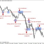
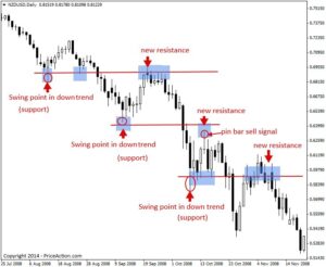
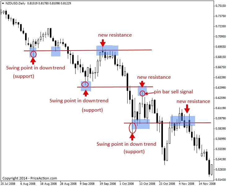
1. Horizontal Support and Resistance
This is the classic version. Price reaches a certain level multiple times and reverses. You draw a horizontal line (or zone) across those touch points.
Examples:
- A stock that bounces off $100 three times in two months.
- A forex pair that stalls at 1.2000 repeatedly.
- A crypto asset that can’t break $50,000.
Why it works: These levels are easy to see. Everyone sees them. They become self-fulfilling because enough traders are watching the same number. When price approaches a well-known round number or a previous high/low, orders cluster there.
The danger: The more obvious a horizontal level is, the more likely it is to be a trap. If everyone sees support at $100 and places their buy orders there, smart money knows those orders exist. They might drive the price slightly below $100 to trigger stop losses, scoop up cheap shares, and then let it bounce. This is called a stop hunt, and it happens at obvious horizontal levels all the time.
2. Trendline Support and Resistance
Trendlines connect a series of higher lows (in an uptrend) or lower highs (in a downtrend). They act as dynamic support and resistance that moves with the trend.
Examples:
- A stock making higher lows at $40, $42, and $44. The trendline connecting them offers support around $46 on the next pullback.
- A falling stock making lower highs at $80, $75, and $72. The trendline offers resistance near $69 on the next bounce.
Why it works: Trendlines represent the rhythm of the market. In an uptrend, buyers are becoming more aggressive, willing to pay higher prices on each dip. The trendline captures that rhythm. When price returns to the trendline, it tests whether that rhythm is still intact.
The danger: Trendlines are subjective. You can draw them through different wicks or candle bodies and get completely different slopes. Two traders looking at the same chart might draw trendlines that are 5% apart — enough to mean the difference between a “bounce” and a “break.” This subjectivity makes trendlines less reliable than horizontal levels unless they’re confirmed by multiple touches and high volume.
3. Dynamic Support and Resistance (Moving Averages)
Moving averages — especially the 20, 50, and 200-period — act as dynamic support and resistance. In a strong uptrend, price often pulls back to the 20-period moving average and bounces. In a weaker trend, it might test the 50-period.
Why it works: Moving averages represent the average price over a period of time. When price pulls back to a moving average, it’s essentially returning to “fair value” according to recent history. Big institutions and algorithmic traders often use moving averages as reference points for entries, which gives them real influence.
The danger: Moving averages are lagging. They tell you where the price was on average, not where it will go. In a fast-moving market, price can slice through a moving average like it’s not even there. Relying on moving averages alone for support/resistance is like using last week’s weather forecast to plan today’s picnic.
Zones vs. Lines: The Debate That Actually Matters
Spend five minutes in any trading forum and you’ll find a holy war between “line traders” and “zone traders.”
Line traders draw precise horizontal lines at exact prices. They place limit orders right on the line and stop losses just beyond it.
Zone traders draw rectangles. They accept that support and resistance exist in a range — maybe $47 to $48 instead of exactly $47.50. They place orders somewhere in the zone and give the trade room to breathe.
The zone traders are right.
Markets are not precise machines. They’re auctions driven by emotions, algorithms, and millions of participants with different agendas. Expecting a stock to bounce at exactly $100.00 because it bounced at $100.00 before is like expecting a crowd of people to stop walking at exactly the same spot on a sidewalk because they did yesterday.
A zone approach is psychologically healthier, too. When you trade a zone, you accept uncertainty. You don’t need to be exactly right. You just need to be directionally right. When you trade a line, every wick below your line feels like a personal attack. You move your stop. You average down. You turn a small loss into a disaster.
If you’re new to this, forget lines. Start thinking in zones. Give the market room to be messy. Your blood pressure will thank you, and so will your account.
The Psychology of the Break: Why Levels Fail
Here’s the part that separates traders who survive from traders who disappear: understanding when support and resistance break, and why.
A support level doesn’t exist because the universe decreed it. It exists because enough people believe in it. And belief can change in an instant.
Support breaks when the selling pressure overwhelms the buying interest at that level. This usually happens because of one of three things:
1. New information. A stock bounces off $50 three times. Then earnings come out terrible. The company announces a fraud investigation. Suddenly, $50 isn’t a memory of a good buying opportunity — it’s a memory of a price that was way too high. Everyone who was willing to buy at $50 is now willing to sell. The support becomes a launchpad for a collapse.
2. Exhaustion. Support holds because buyers step in. But buyers are a finite resource. Every time price tests support, some of those buyers get used up. They deploy their capital. They have no more dry powder. After three or four tests, the buyers are exhausted. The sellers are not. On the next test, there simply aren’t enough buyers left, and the level crumbles.
3. Stop cascades. This is the dirty secret of technical trading. When a well-known support level is breached, every trader who placed a stop loss just below that level gets triggered. Those stop losses are actually sell orders. So the initial break causes a flood of automatic selling, which drives the price lower, which triggers more stops, which drives the price even lower. A small break becomes a waterfall.
This is why you never, ever place a stop loss exactly at a support level. You place it below the zone, giving the market room for a stop hunt. If your stop is at the same price that every other trader is watching, you’re offering your money to the market on a silver platter.
The Flip: When Resistance Becomes Support
One of the most reliable patterns in technical analysis is the flip. When a resistance level is finally broken, it often becomes support on the next pullback. When a support level is broken, it often becomes resistance on the next bounce.
Why?
Because of the people who missed the move.
Imagine a stock that stalls at $100 for months. Traders who wanted to buy at $90 are now watching from the sidelines, angry that they didn’t get in. When the price finally breaks above $100, those traders don’t chase immediately. They wait. They hope for a pullback to $100 so they can buy “at a better price.”
When the pullback happens, all those waiting buyers step in at $100. The former resistance is now flooded with buy orders. It becomes support.
The same logic works in reverse. A stock that bounces off $50 three times has created a crowd of buyers who feel validated. When the price finally breaks below $50, those buyers are trapped. They held on because they believed in the support. Now they’re underwater. When the price bounces back toward $50, those same buyers — who are now desperate to escape without a loss — sell. The former support becomes resistance.
This flip dynamic is one of the most powerful tools in a trader’s arsenal. But it only works if you wait for the break to happen first. Too many traders try to predict the flip before the break. They buy at resistance, hoping it will become support. That’s not trading. That’s wishful thinking.
Round Numbers: The Invisible Magnets
There’s a peculiar phenomenon in markets: round numbers act as support and resistance far more often than random numbers would suggest.
A stock is more likely to stall at $100 than at $103. A forex pair is more likely to reverse at 1.2000 than at 1.2037. Crypto assets love to cluster around $50,000, $60,000, and $70,000.
Why? Because humans are lazy, and lazy humans place orders at round numbers.
If a trader decides to take profits, they don’t type in $97.43. They type in $100. If a portfolio manager sets a buy limit, they don’t choose $49.82. They choose $50. The result is that round numbers accumulate massive order clusters, which makes them self-fulfilling support and resistance levels.
This is useful for two reasons. First, if you’re looking for a level that other people are watching, round numbers are a safe bet. Second, if you’re placing your own orders, avoid round numbers. Don’t set your stop at $50. Set it at $49.73. Don’t set your target at $100. Set it at $99.85. You’ll avoid the crowd and reduce the chance of getting caught in a stop hunt.
Volume: The Lie Detector Test
Support and resistance without volume is like a detective story without fingerprints. It might look convincing, but there’s no evidence.
Volume tells you whether a level is real or imaginary.
When price approaches a support level and volume spikes, that’s confirmation. It means people are actually trading at that level. Orders are being filled. There’s genuine interest.
When price approaches a support level and volume dries up, be suspicious. A bounce on low volume is often a “dead cat bounce” — a temporary pause before the real move continues. The buyers aren’t committed. They’re just nibbling.
The most powerful breaks happen on high volume. When resistance at $100 is shattered by a candle that closes above it with volume three times the average, that’s not a fakeout. That’s a genuine regime change. The market has voted with its wallet.
Conversely, a break above resistance on low volume is a trap. The price might close above the level, but there’s no conviction behind it. It often falls back below within hours or days.
If you’re not looking at volume when you evaluate support and resistance, you’re flying blind. Add volume to your chart. Make it a non-negotiable part of your analysis.
Timeframes: The Level That Works on One Chart and Fails on Another
Here’s a mistake that costs traders fortunes: assuming that a support level on a daily chart means anything on a 5-minute chart.
Support and resistance are timeframe-dependent. A level that has held for six months on a daily chart is significant. A level that held for two hours on a 5-minute chart is trivia.
In general, the higher the timeframe, the more significant the level. A support zone on a weekly chart has been tested by thousands of traders over months. It represents deep, structural market memory. A support zone on a 1-minute chart represents the memory of traders who are probably already flat and moved on.
This doesn’t mean short-term levels are useless. Day traders live and die by 5-minute and 15-minute support and resistance. But you need to understand the hierarchy. If you’re day trading, the daily chart gives you the “big picture” levels that matter most. The 5-minute chart gives you entry and exit timing. You don’t trade 5-minute support in isolation if it’s fighting against a major daily resistance.
A good rule of thumb: the level on the higher timeframe always wins. If the daily chart says resistance is at $100, and the 5-minute chart says support is at $99.50, guess what? The daily chart is the boss. The 5-minute support is likely to fail.
Common Myths That Destroy Accounts
Before we wrap up, let’s kill some myths that float around trading forums like bad rumors.
Myth 1: “The more times a level is tested, the stronger it becomes.”
Wrong. The more times a level is tested, the weaker it becomes. Every test uses up buyers or sellers. A support level that holds on the first test is strong. A support level that holds on the fifth test is exhausted and likely to break.
Myth 2: “Support and resistance work in all markets.”
They work best in liquid, trending markets with human participation. In thinly traded penny stocks, a single large order can blow through any level. In pure algorithm-driven markets, support and resistance can be less reliable because machines don’t have memories — they have code.
Myth 3: “You should always buy at support and sell at resistance.”
This is the mean reversion trap. In a strong trend, buying at support is smart. In a strong trend, selling at resistance is suicide. If a stock is in a parabolic uptrend, resistance is a temporary pause, not a reversal point. You sell at resistance in ranging markets. You buy pullbacks to support in trending markets. Context matters.
Myth 4: “Wicks don’t count — only candle bodies matter.”
This is a convenient excuse for traders who want to ignore price action that invalidates their lines. A wick is a price that the market actually traded. It represents real buyers or sellers who stepped in at that level. If a stock dips below your support line with a long wick and then closes back above, that wick is telling you something important: sellers tried to break the level and failed. That’s actually bullish. Ignoring wicks means ignoring half the story.
How to Actually Trade Support and Resistance
Let’s get practical. Here’s a framework you can use today.
Step 1: Identify the major levels on the daily chart. Mark the most obvious highs and lows from the past 3-6 months. These are your “zones of interest.” Don’t overcomplicate it. If you need a magnifying glass to find the level, it’s not a level.
Step 2: Determine the trend. Is the market making higher highs and higher lows (uptrend)? Or lower highs and lower lows (downtrend)? In an uptrend, you primarily look to buy support. In a downtrend, you primarily look to sell resistance. In a range, you can do both — but ranges are harder and more dangerous.
Step 3: Wait for price to approach a level. Don’t anticipate. Don’t place a limit order at support hoping price will get there. Wait for it to actually approach. Watch how it behaves. Is volume increasing? Is the approach slowing down? Are candles getting smaller? These are signs that the level might hold.
Step 4: Look for confirmation. A level alone is not a trade. You need confirmation. This could be:
- A reversal candlestick pattern (hammer, engulfing, pin bar)
- A divergence on RSI or MACD
- A volume spike at the level
- A rejection wick that shows buyers/sellers stepping in
Step 5: Define your risk before you enter. Where is your stop? It should be beyond the zone, not at the zone. If you’re buying support at $50, your stop might be at $49.20 — below the zone and below any recent wicks. Your target should be logical: the next resistance level, or a risk-reward ratio of at least 2:1.
Step 6: Manage the trade. If the level holds and price moves in your favor, don’t get greedy. Move your stop to breakeven when you have a cushion. Take partial profits at the first logical target. Let the rest run with a trailing stop.
Step 7: If the level breaks, don’t fight it. If support breaks and you’re long, get out. Don’t hope. Don’t average down. Don’t “wait for a bounce.” A broken level is a broken thesis. The market has told you that you’re wrong. Listen.
The Real Skill: Reading the Market’s Memory
At the end of the day, support and resistance are not about lines. They’re about understanding that markets are made of people, and people have memories. They remember where they bought. They remember where they sold. They remember where they felt stupid or smart. And they act on those memories when price returns to those places.
The best traders don’t have better lines. They have better context. They know when a level is likely to hold and when it’s likely to break. They know when to be patient and when to be aggressive. They know that a level on a chart is just a hypothesis until the market confirms it.
If you take one thing from this article, let it be this: support and resistance are probabilities, not promises. They are places where something interesting might happen. They are not places where something must happen. Treat them with respect, but not with reverence. Use them as guides, not as gospel.
Draw your zones. Mark your levels. But never forget that the market doesn’t care about your lines. It cares about fear, greed, memory, and money. Your job is to read those forces — and use support and resistance as the map, not the territory.