Why everyone Googles this, why the answer isn’t what you think, and how to actually use the “Big Three” without blowing up your account
The 2 AM Google Search
It’s 2:17 AM. You’re staring at a candlestick chart that looks like a seismograph during an earthquake. Your last trade just stopped out. Your account is down 12% for the week. And you’re doing what millions of day traders have done before you:
Typing “best indicators for day trading” into Google.
You click through the first three results. Site one gives you a Wikipedia definition of RSI. Site two shows you a MACD crossover with a big green arrow and the caption “perfect entry!” Site three explains Bollinger Bands using a chart from 2014 that conveniently proves the author’s point.
None of them tell you what you actually need to know. None of them explain why you’ve already used all three of these indicators and still lost money. None of them admit the uncomfortable reality that indicators don’t give you an edge — you give yourself an edge by how you use them.
This article is going to be different. We’re not doing textbook definitions. We’re doing the psychology of why these three indicators dominate day trading, why they fail most people who use them, and how to actually deploy them without becoming another statistic.
The Psychology of the “Holy Grail” Hunt
Before we talk about RSI, MACD, or Bollinger Bands, we need to talk about why you’re searching for them in the first place.
The human brain hates uncertainty. It craves patterns, signals, and clear instructions. When you look at a raw price chart, your brain screams for help. It wants someone — or something — to tell it what to do. Indicators exist because they reduce the cognitive load of trading. They turn a messy, ambiguous chart into a clean, colored line with clear boundaries.
The problem is that comfort and profitability are inversely correlated in trading.
When an indicator makes you feel safe, it’s usually because it’s oversimplified the market. When an indicator makes you feel uncertain, it’s usually because it’s showing you something real. Most traders choose the comfortable lie over the uncomfortable truth.
RSI, MACD, and Bollinger Bands are the “Big Three” not because they’re the best, but because they’re the most comfortable. They’re easy to understand, easy to visualize, and easy to misuse. Every broker platform has them pre-installed. Every trading guru has a YouTube video about them. And every new trader thinks that if they just combine them in the right way, they’ll unlock the secret.
Spoiler: there is no secret. But there is a right way to think about these tools. Let’s break them down, one by one, with the honesty you won’t find on Investopedia.
RSI: The Seductive Lie of Overbought and Oversold
What RSI Actually Measures
The Relative Strength Index (RSI) was developed by J. Welles Wilder in 1978. It measures the speed and magnitude of recent price changes on a scale of 0 to 100. That’s the textbook answer.
Here’s the psychological translation: RSI measures whether the recent price action has been dominated by buyers or sellers, and how extreme that dominance has become.
When RSI is above 70, the textbook says the asset is “overbought.” When it’s below 30, it’s “oversold.” And this is where the trouble starts.
The Trap That Kills New Traders
The most common way new traders use RSI is also the most dangerous: they sell when RSI hits 70 and buy when it hits 30.
This works beautifully in a ranging market. It destroys you in a trending market. And here’s the thing — day trading happens in trending markets more often than ranging ones. A stock that goes from $50 to $80 in three days can stay “overbought” on RSI for the entire move. If you keep shorting every time RSI hits 70, you get run over by a freight train.
The psychological damage here is severe. You start with a simple rule: “RSI above 70 = sell.” You win a few times in choppy conditions. Your brain encodes this as a valid pattern. Then the market trends. You lose. You lose again. You lose bigger. Instead of questioning the rule, you question yourself. “I must be using it wrong.” So you adjust the settings from 14-period to 7-period. Or 21-period. Or you add a moving average to smooth it. You’re not improving your strategy — you’re rearranging deck chairs on the Titanic.
The Only RSI Edge That Actually Works
If overbought/oversold is a trap, what actually works?
RSI divergence.
Bullish divergence happens when price makes a lower low, but RSI makes a higher low. It means the sellers are exhausting themselves — the down moves are getting weaker even though the price is still dropping. Bearish divergence is the opposite: price makes a higher high, but RSI makes a lower high. The buyers are running out of steam.
This works because RSI measures momentum, not price. And momentum always shifts before price does. It’s not perfect — nothing is — but divergence is the only RSI signal that has a genuine statistical edge in day trading, especially on the 5-minute and 15-minute timeframes.
But here’s the catch: divergence is rare. You might see it once or twice a day on a single chart. Most of the time, RSI is just wiggling around giving you noise. The traders who make money with RSI are the ones who can sit on their hands 90% of the time and only pull the trigger when genuine divergence appears. The traders who lose money are the ones who trade every overbought/oversold signal because they can’t handle the boredom of waiting.
RSI Settings: The 14-Period Myth
Wilder originally used 14 periods. Most platforms default to 14. And most traders never question it.
For day trading, 14 periods is often too slow. By the time RSI(14) signals divergence, the move might already be half over. Many day traders use 9 or 7 periods for faster signals. But faster signals mean more false positives. It’s a trade-off.
The honest answer? The period doesn’t matter as much as your discipline. A 14-period RSI with strict divergence rules will outperform a 7-period RSI used by someone who trades every wiggle. The indicator is just a lens. Your psychology is the photographer.
MACD: The Lagging Indicator That Traders Treat Like a Crystal Ball
What MACD Actually Measures
MACD stands for Moving Average Convergence Divergence. It has three components: the MACD line (12 EMA minus 26 EMA), the signal line (9 EMA of the MACD line), and the histogram (the difference between the two).
Psychologically, MACD is telling you one thing: the relationship between short-term and long-term momentum is changing.
When the MACD line crosses above the signal line, it means short-term momentum is accelerating faster than long-term momentum. When it crosses below, short-term momentum is decelerating. That’s it. It’s not a buy signal. It’s not a sell signal. It’s a momentum report.
The Crossover Trap
The most popular MACD strategy is the crossover: buy when MACD crosses above the signal line, sell when it crosses below. This is taught in every beginner trading course and it is financially devastating when used in isolation.
Why? Because MACD is a lagging indicator. It’s derived from moving averages, which are themselves lagging. By the time the crossover happens, the move you’re trying to catch is often already over. In day trading, where moves can last minutes, that lag is deadly.
Picture this: A stock gaps up on news. It runs 3% in 10 minutes. MACD finally crosses bullish. You buy. The move is exhausted. It pulls back. Your stop gets hit. MACD crosses bearish. You sell. It bounces. This is the “whipsaw hell” that destroys crossover traders.
The psychological problem is that crossovers feel decisive. They give you a clear moment to act. Your brain loves clear moments. But the market doesn’t care about your need for clarity. The market is already moving while your indicator is still calculating.
How MACD Actually Helps Day Traders
MACD’s real value isn’t in predicting entries — it’s in confirming the strength of a move that’s already happening.
When you’re in a trade, MACD can tell you whether the momentum is supporting your position or fighting it. If you’re long and MACD histogram is making higher highs, the trend has energy. If you’re long and MACD histogram is making lower highs while price rises, that’s bearish divergence. The trend is weak. Time to tighten your stop or take profits.
MACD is also useful for filtering out bad trades. If you’re considering a long entry but MACD is below zero and the histogram is shrinking, you’re trying to catch a falling knife. Pass. Wait for MACD to show some sign of life.
Think of MACD not as a trigger, but as a second opinion. You wouldn’t get surgery because one doctor said so. You’d want confirmation. MACD is your second opinion on momentum. It should never be the primary reason you take a trade.
The Zero Line: The Most Ignored MACD Feature
Most traders obsess over crossovers and ignore the zero line. This is a mistake.
The zero line on MACD represents the point where the 12 EMA and 26 EMA are equal. When MACD is above zero, the short-term average is above the long-term average — the trend is up. When MACD is below zero, the trend is down.
For day traders, this is crucial. Buying bullish crossovers below the zero line is a counter-trend trade. It might work, but the odds are against you. Buying bullish crossovers above the zero line is a trend-following trade. The odds are better.
The traders who survive are the ones who use MACD to trade with the trend, not against it. The traders who blow up are the ones who see a bullish crossover in a downtrend and think “this is the bottom!” It’s almost never the bottom.
Bollinger Bands: The Squeeze, the Breakout, and the Lie of Mean Reversion
What Bollinger Bands Actually Measure
Bollinger Bands consist of three lines: a 20-period simple moving average (SMA) in the middle, and two standard deviation bands above and below it.
Psychologically, Bollinger Bands are telling you: this is how far price has stretched from its average, based on recent volatility.
When the bands widen, volatility is expanding. When they narrow, volatility is contracting. When price touches the upper band, it’s at the high end of its recent range. When it touches the lower band, it’s at the low end.
The Mean Reversion Fantasy
The most common misuse of Bollinger Bands is mean reversion trading: “Price touched the upper band, so it must come back down. Sell!”
This logic works in ranging markets. It fails catastrophically in trending markets. And day trading is full of trends. A stock breaking out on volume can walk the upper Bollinger Band for hours, even days. If you keep shorting it because “it’s overextended,” you get destroyed.
The psychological appeal of mean reversion is deep and ancient. Human beings are wired to expect things to return to normal. If something gets too hot, it must cool down. If something gets too cold, it must warm up. This heuristic works great in everyday life. It works terribly in financial markets, where trends can persist far longer than rationality would suggest.
The Squeeze: The Only Bollinger Band Setup Worth Trading
There is one Bollinger Band setup that genuinely has an edge for day traders: the squeeze.
A squeeze happens when the bands narrow dramatically, indicating that volatility has compressed to an extreme. This is the market holding its breath. When the bands finally expand and price breaks out of the squeeze, the move tends to be powerful and directional.
The squeeze works because volatility is mean-reverting in the short term. Low volatility periods tend to be followed by high volatility periods. The direction of the breakout is harder to predict, which is why you need other tools (like volume, or RSI divergence, or MACD crossovers above/below zero) to confirm.
But here’s the key: you don’t predict the breakout. You react to it. Most traders try to guess which way the squeeze will break. They place buy stops and sell stops on both sides and hope for the best. That’s not trading — that’s gambling. The professional waits for the breakout to happen, confirms it with volume, and then enters in the direction of the break.
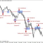
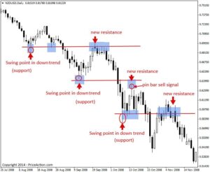
Walking the Band: The Trend Trader’s Secret
There’s another way to use Bollinger Bands that almost no beginner knows about: walking the band.
In a strong uptrend, price doesn’t just touch the upper band and reverse. It often “walks” along the upper band, using it as dynamic support. In a strong downtrend, it walks the lower band. Day traders who understand this don’t short the upper band — they buy pullbacks to the middle band (the 20 SMA) in an uptrend, or sell bounces to the middle band in a downtrend.
This requires you to first identify that a trend exists. It requires you to stop fighting the market and start flowing with it. And that, psychologically, is the hardest thing for new traders to do. It feels wrong to buy something that’s “already gone up.” It feels right to “get a discount” by buying at the lower band. But in a trend, the discount is at the middle band, not the lower band.
The Combination: How to Use the Big Three Together
So if each indicator has fatal flaws when used alone, how do you combine them?
Here’s a framework that actually works for day trading. Not because it’s magic, but because it forces you to wait for confluence — multiple pieces of evidence pointing in the same direction.
The Confluence Checklist
Before taking a long trade, ask yourself:
- Is price above the 20 SMA on Bollinger Bands? (Trend direction)
- Is MACD above zero and the histogram expanding? (Momentum confirmation)
- Is RSI showing bullish divergence or holding above 40 during a pullback? (Momentum health)
If all three say yes, you have a high-probability setup. If two say yes and one says no, you have a maybe. If only one says yes, you have a gamble.
For short trades, reverse the logic. Price below the 20 SMA. MACD below zero. RSI showing bearish divergence or holding below 60 on a bounce.
The 5-Minute + 15-Minute Dance
Day traders often get destroyed because they only look at one timeframe. The 5-minute chart says buy. The 15-minute chart says sell. They buy. They lose.
Use the 15-minute chart for the “big picture” and the 5-minute chart for entry timing. If the 15-minute chart is trending up with all three indicators aligned, then you only look for long setups on the 5-minute chart. You ignore short signals. You become a trend follower, not a coin flipper.
This sounds simple. It is simple. But it requires the discipline to not trade when conditions aren’t perfect. And that discipline is where 90% of traders fail.
What to Do When They Disagree
Sometimes RSI says overbought, MACD says bullish, and Bollinger Bands say squeeze. What then?
You don’t trade.
This is the answer that no one wants to hear. When indicators conflict, the market is uncertain. Uncertain markets eat day traders alive. The professional steps aside. The amateur forces a trade because they can’t handle the inaction.
If you only took trades when RSI, MACD, and Bollinger Bands all agreed, you’d trade maybe two or three times a day. That’s fine. Two or three good trades are infinitely better than ten bad ones.
Why Indicators Will Never Give You an Edge
Here’s the part where I risk making you angry.
RSI, MACD, and Bollinger Bands will never give you an edge because everyone has them.
Every trading platform on earth has these three indicators pre-installed. Every trader with a smartphone can see the same signals you see. If an edge existed in the indicator itself, it would be arbitraged away instantly by algorithms that can process these signals faster than you can blink.
The edge doesn’t exist in the indicator. It exists in:
- Your ability to wait for high-confluence setups
- Your willingness to sit out uncertain markets
- Your discipline to follow a plan instead of chasing excitement
- Your risk management that keeps you alive through losing streaks
A losing trader with perfect indicators is still a losing trader. A winning trader with mediocre indicators can still make money. The difference is psychology, not software.
The Real Reason You Keep Losing (Even With the “Best” Indicators)
If you’ve read this far, you might be feeling a mix of enlightenment and frustration. “So I’ve been using these indicators wrong. Great. Now what?”
The “now what” is the hard part. Because the real problem isn’t that you didn’t know how to use RSI, MACD, or Bollinger Bands. The real problem is that you wanted them to think for you.
Indicators are training wheels. They’re useful when you’re learning to balance, but they become a crutch if you never learn to ride without them. The best day traders I know don’t look at indicators first. They look at price. They look at volume. They look at structure — support, resistance, trendlines, patterns. They use indicators only to confirm what price is already telling them.
Price is the market’s language. Indicators are just translations. And every translation loses something in the process.
If you want to stop losing, stop asking “which indicator is best?” Start asking “what is price actually doing?” Build your skill at reading raw charts. Use indicators as confirmation, not as a replacement for your own judgment.
A Practical Day Trading Routine (Using the Big Three)
Let me leave you with something concrete. Here’s how a professional day trader might actually use these tools in a session:
Pre-market (30 minutes before open):
- Identify the trend on the 15-minute and hourly charts.
- Mark key support and resistance levels.
- Check if any major news is coming.
First hour (high volatility):
- Wait for the opening range to establish.
- Look for a Bollinger Band squeeze on the 5-minute chart.
- Confirm direction with MACD above/below zero.
- Check RSI for divergence at key levels.
Mid-day (lower volatility):
- Reduce size or stop trading.
- If trading, only take pullbacks to the 20 SMA in the direction of the trend.
- Use RSI to time entries — buy when RSI pulls back to 40-50 in an uptrend.
Last hour:
- Avoid new entries unless a clear squeeze breakout develops.
- Manage existing positions.
- Review the day’s trades in a journal.
Notice what’s missing? There’s no “check RSI and buy when it hits 30.” There’s no “MACD crossed, go all in.” There’s patience. There’s context. There’s a structure.
Final Thoughts: The Indicator Is Not the Strategy
RSI, MACD, and Bollinger Bands are tools. They’re not strategies. They’re not edges. They’re not holy grails.
The best indicator for day trading is the one you understand deeply enough to know when it’s lying to you. Because they all lie. RSI lies in strong trends. MACD lies in choppy markets. Bollinger Bands lie during low volatility.
Your job isn’t to find the perfect indicator. Your job is to build a decision-making framework that uses multiple imperfect tools to tilt the odds slightly in your favor — and then to manage your risk so that when the tools are wrong (which they often will be), you survive to trade another day.
Stop searching for the best indicator. Start becoming the best trader.